
Quick Reference
- A carousel is a slideshow of rotating images that can be used to inform users of special promotions and to direct them to various areas of your website. To manage the carousel, navigate to Content → Carousel in the left menu.
- Use the “Simple / Showcase” toggle in the top-left corner of the page to switch between the two modes of displaying the carousel. In simple mode, one slide will be shown at a time. In showcase mode, multiple slides will be shown side-by-side with their names displayed underneath.
- Click the “Configure Carousel” button in the top-right corner of the screen to modify the carousel’s behavior.
- Disable the “Enable” toggle to remove the carousel from your website.
- Disable the “Autoplay” toggle to prevent the carousel from automatically advancing to the next slide.
- Click the “Create Slide” button in the bottom-right corner of the screen to add a new slide to the carousel. Click the pencil icon
next to an existing slide to edit it.
Introduction
A carousel is a slideshow of rotating images that can be used to inform users of special promotions and to direct them to various areas of your GateWay eCommerce website. When the carousel is enabled, it will appear at the top of your website’s home page, making it an important and impactful element of your site’s design.
The carousel can be managed via the Carousel page, located at Content → Carousel in the left navigation menu.
Carousel Page
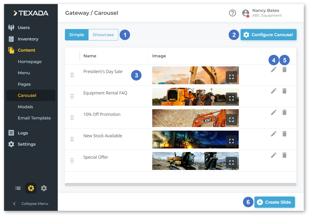
- Simple / Showcase Toggle
Use this option to toggle between the two major styles of slider:- Simple: One slide is displayed at a time. When the slider advances, the displayed slide will change.
- Showcase: Multiple slides are displayed side-by-side. When the slider advances, the displayed slides will shift over by one, hiding the oldest slide and revealing the next slide.
- Configure Carousel Button
Click to open the Carousel Configurations window and adjust the carousel’s behavior. See “Carousel Configurations” for more information. - Slide
Click and drag the six dotsto the left of a slide to change the order of the slides. Click the expand image icon
in the bottom-right corner of the slide’s image to view it full-size.
- Edit Icon
Click the pencil icon - Delete Icon
Click the bin iconnext to a slide to delete it.
- Create Slide Button
Click to add a new slide to the carousel. See “Create / Edit Slide” for more information.
Carousel Configurations
Click the “Configure Carousel” button 
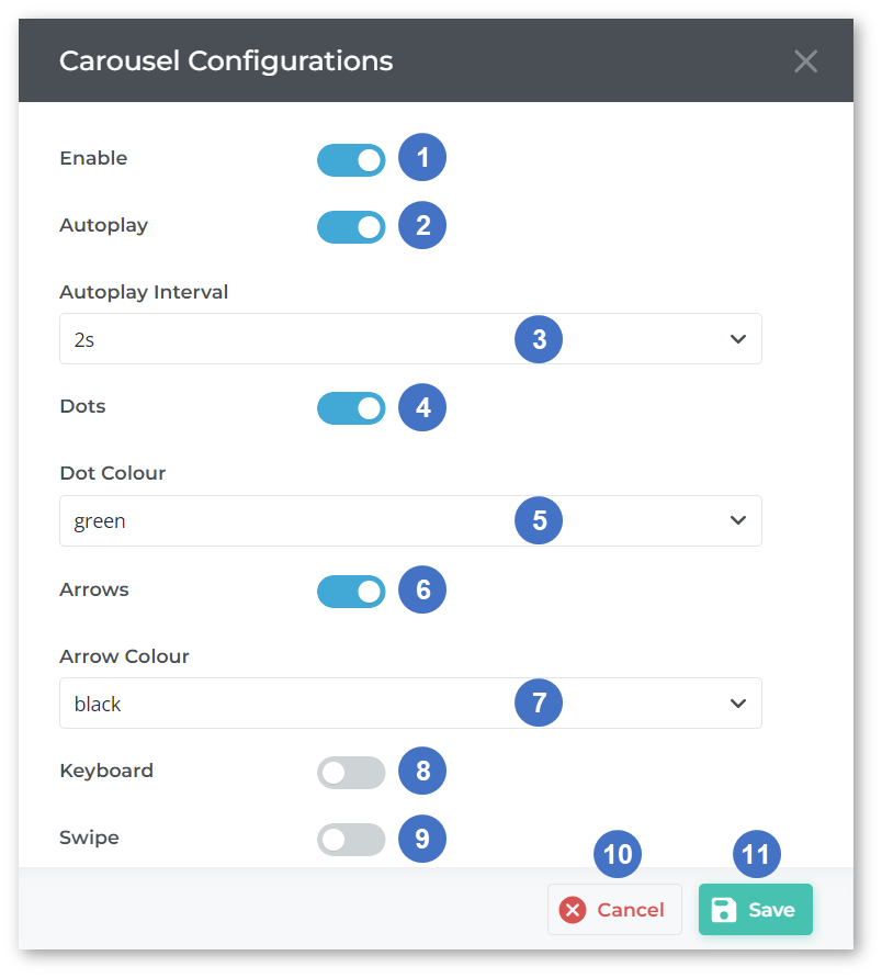
- Enable Toggle
- Enabled: The carousel will be displayed at the top of your website’s home page.
- Disabled: The carousel will not be displayed.
- Autoplay Toggle
- Enabled: The carousel will automatically advance through slides at the rate determined by the “Autoplay Interval” field (3).
- Disabled: The carousel will not automatically advance through slides.
- Autoplay Interval
The time, in seconds, that each slide will remain visible if autoplay is enabled (2). - Dots Toggle
- Enabled: A series of semi-transparent dots will be visible at the bottom of the carousel, each representing a slide. Visitors to the website can navigate between the slides by clicking on these dots.
- Disabled: Dots will not be appear on the carousel.
- Dot Colour
The color of the carousel dots, if enabled (4). - Arrows Toggle
- Enabled: A pair of semi-transparent arrows will be visible at the left and right edges of the carousel. Visitors can use these arrows to advance to the next slide or return to the previous slide.
- Disabled: Arrows will not appear on the carousel.
- Arrow Colour
The color of the carousel arrows, if enabled (7). - Keyboard Toggle
- Enabled: Visitors can use the left and right arrow keys on their keyboard to advance to the next slide or see the previous slide.
- Disabled: Keyboard controls are disabled.
- Swipe Toggle
- Enabled: Visitors can swipe left or right on their touchscreen to advance to the next slide or see the previous slide.
- Disabled: Touch controls are disabled.
- Cancel Button
Click to close the Carousel Configurations window without saving your changes. - Save Button
Click to save your changes.
Create / Edit Slide
Click the “Create Slide” button 
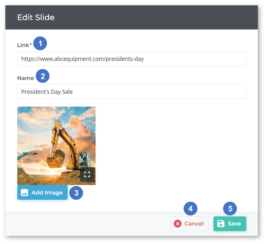
- Link
The URL to which the user will be sent when they click on the slide in the carousel. Make sure to enter the full URL of the destination starting with http:// to ensure that the user is sent to the correct address upon clicking. - Name
The name of the slide. This will appear beneath the slide when the carousel is in Showcase mode. - Add Image Button
Click to open the file manager and upload an image for the slide. Images must be under 2 megabytes in size. - Cancel Button
Click to cancel your changes. - Save Button
Click to save your changes.